Why infrastructure data matters now
Traditional price action tells you what happened. It does not tell you why it happened or what will happen next. In high-stakes markets, relying solely on candlesticks and moving averages is like driving by looking in the rearview mirror. You see the path you just traveled, but you cannot see the ice on the road ahead. On-chain and infrastructure metrics provide that forward-looking visibility. They reveal the structural health of the network and the behavior of participants before price reacts.
The alpha has shifted from sentiment analysis to data-driven infrastructure analysis. While social media buzz and news headlines drive short-term volatility, they often obscure the underlying reality of network usage, transaction volume, and active addresses. When the infrastructure is robust and growing, price trends tend to follow. When the infrastructure is strained or decaying, price corrections are inevitable, regardless of how positive the sentiment appears.
This guide uses the OBSDN framework to help you interpret this data. We will not waste time on abstract theory. Instead, we will look at the specific indicators that matter. By focusing on the structural data, you gain a clearer picture of market strength and weakness. This approach removes the guesswork and replaces it with observable evidence. The goal is to make informed decisions based on what is actually happening on the network, not what traders are hoping will happen.
Understanding the difference between price and infrastructure is the first step to mastering market strategy. Price is the output; infrastructure is the input. By monitoring the input, you can anticipate the output. This is the new standard for serious market analysis. It requires discipline and a willingness to look past the noise, but the clarity it provides is unmatched.
Setting up the OBSDN research environment
Before you can monitor infrastructure health in real-time, you need a stable local environment. Obsidian serves as the central hub for your research, but it requires specific configuration to handle high-frequency data feeds without lag. This setup ensures your dashboard remains responsive when market conditions shift rapidly.
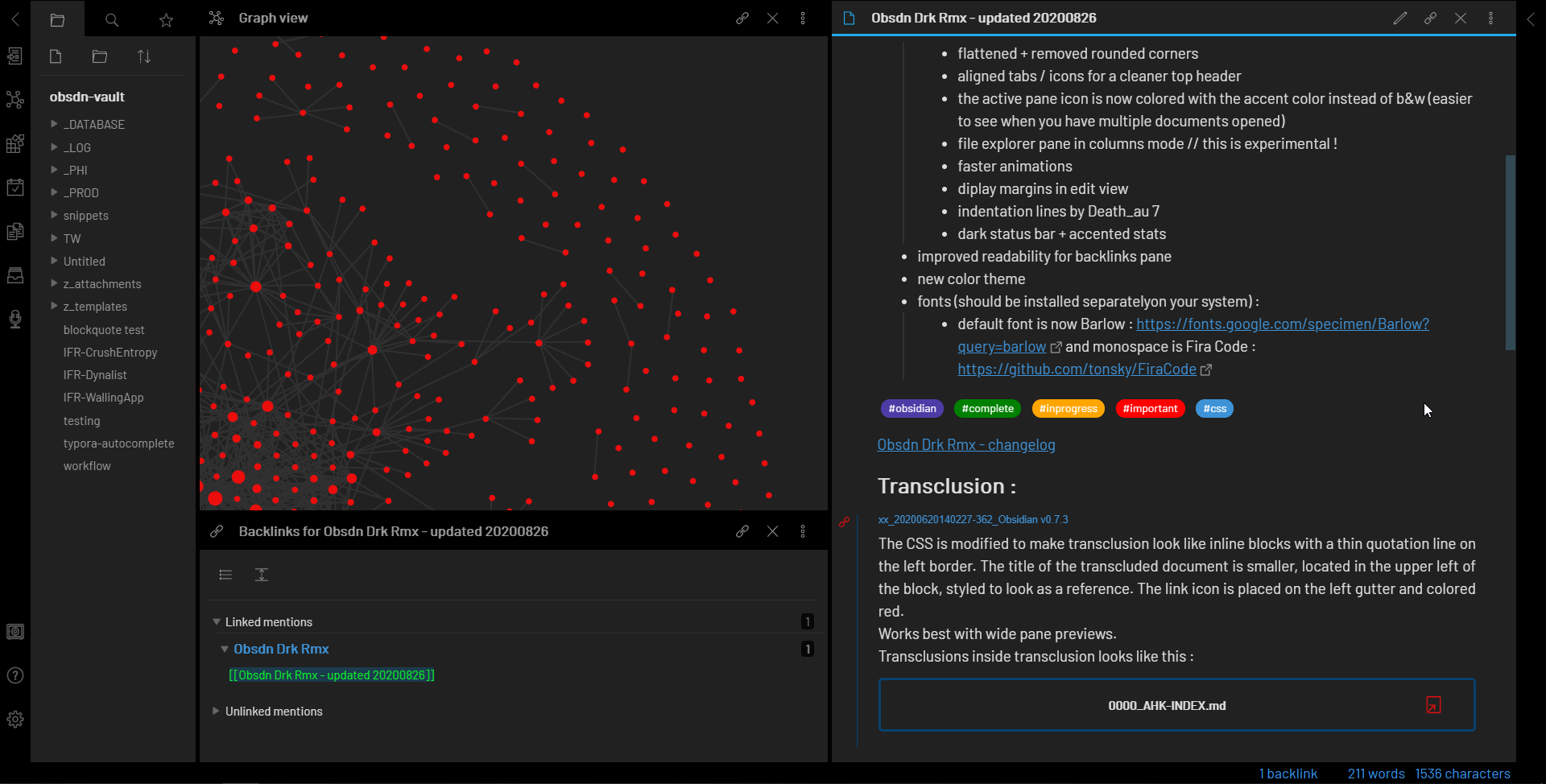
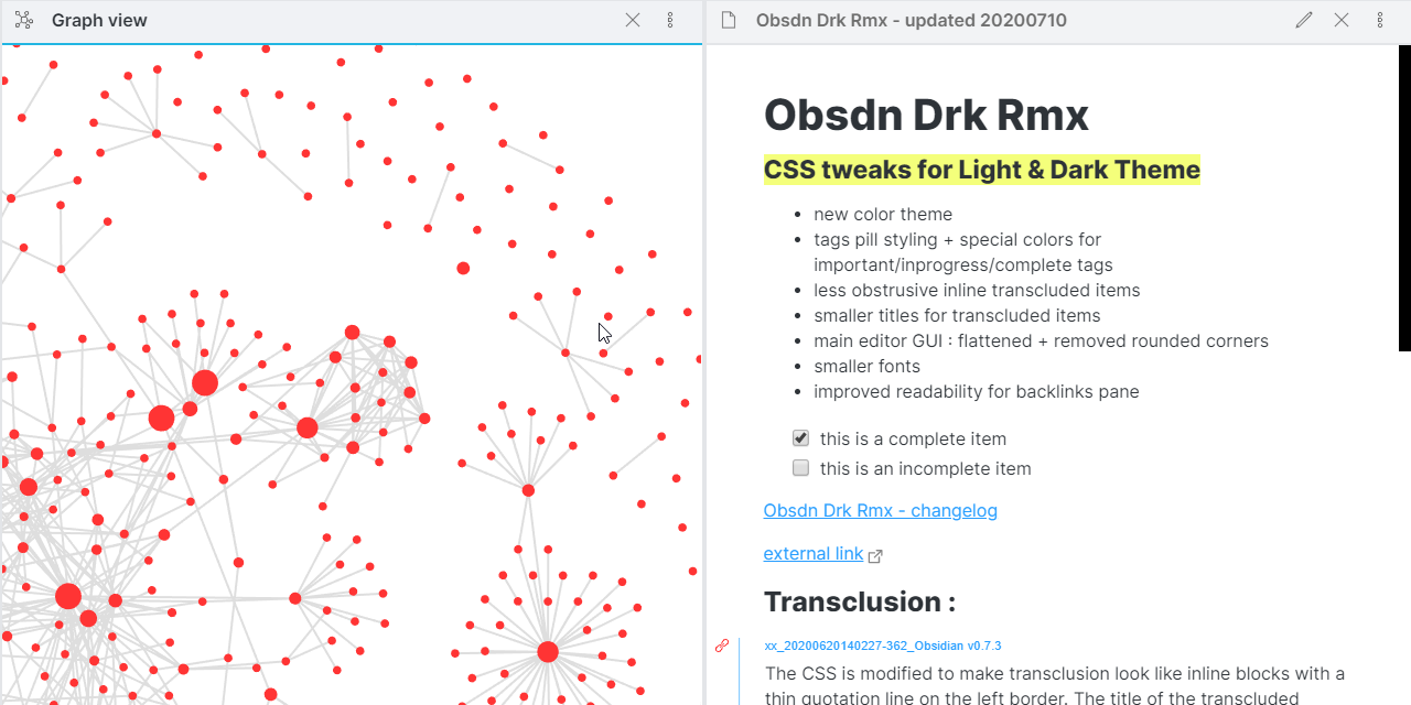
Download the latest version of Obsidian from the official site. Create a dedicated vault for OBSDN research to keep your data isolated from personal notes. Enable community themes that prioritize high contrast and readability, as you will be scanning dense data tables for extended periods.
You need three core plugins: Dataview for querying your local data, Calendar for tracking daily infrastructure metrics, and Templater for automating daily report generation. These tools transform a static note-taking app into a dynamic research terminal. Install them via the Community Plugins marketplace and enable them immediately.

Link your external data feeds to the vault. If you are using CSV exports, place them in a dedicated data/ folder. For API-driven feeds, set up a script that updates your local JSON files every few minutes. Ensure your file permissions allow the Obsidian process to read these updates without manual intervention.
Create a master dashboard note using Templater. Embed Dataview queries that pull the latest infrastructure health scores from your data folder. Use callouts to highlight critical failures or anomalies. This single page becomes your command center, displaying the current state of your monitored assets at a glance.
With the environment configured, you can now focus on interpreting the data. The OBSDN framework relies on this clean, automated pipeline to provide accurate signals. Without this foundation, manual data entry introduces errors that can distort your market strategy. Keep your vault tidy and your queries efficient to maintain speed.
| Plugin | Purpose | Update Frequency |
|---|---|---|
| Dataview | Data querying | Real-time |
| Calendar | Timeline tracking | Daily |
| Templater | Report automation | On-demand |
Key infrastructure metrics to track
Infrastructure data doesn't just sit there; it breathes. The health of the Obsidian network (OBSDN) can be read through a few specific technical indicators that often precede broader market movement. By monitoring these signals, you can identify shifts in network utility before they fully manifest in price action. The goal is to move beyond vague sentiment and track concrete, on-chain reality.
Node Count and Network Stability
The number of active nodes is the most direct measure of network resilience. A rising node count indicates growing developer confidence and infrastructure investment, while a sudden drop often signals maintenance issues or economic disincentives. This metric serves as a foundational layer; without sufficient nodes, the network cannot reliably process transactions, regardless of user demand. Look for steady, organic growth in node distribution rather than sharp, speculative spikes that may not be sustainable.
Transaction Volume and Latency
Transaction volume reveals the actual utility of the protocol. High volume with low latency suggests a healthy, efficient network where users can execute trades or operations without friction. Conversely, high volume paired with rising latency indicates congestion, which can deter users and lead to network fatigue. Tracking the relationship between these two metrics helps you understand whether the network is scaling effectively or struggling under load.
Correlation with Market Action
These infrastructure metrics often lead price movements. When network fundamentals improve—more nodes, faster transactions, higher volume—the market typically responds as institutional and retail participants recognize the increased reliability. The chart below illustrates how infrastructure health can correlate with price trends, providing a visual reference for these leading indicators.
Reading the Signals
Understanding these metrics requires context. A single data point rarely tells the whole story. Instead, look for trends over time. For example, a gradual increase in node count alongside stable latency is a strong bullish signal, suggesting organic growth. On the other hand, if transaction volume spikes but node count remains static, the network may be approaching capacity limits. Use these insights to inform your market strategy, focusing on the underlying health of the OBSDN ecosystem rather than short-term noise.
Turning Infrastructure Data Into Trading Signals
Raw infrastructure data is noise until you map it to market behavior. The OBSDN framework treats infrastructure states as leading indicators for volatility and liquidity shifts. You aren't guessing; you are reading the structural stress points of the market.
Think of infrastructure data like the hull of a ship. You can see the waves (price action), but the hull integrity (data flow, node health, latency) tells you if the ship will take on water. When infrastructure degrades, liquidity dries up before price drops. When it stabilizes, buying pressure often precedes the breakout.
We compare three primary infrastructure states below. Each state triggers a distinct signal:
| Infrastructure State | Market Implication | Trading Signal | Risk Profile |
|---|---|---|---|
| Optimal | High liquidity, low friction | Accumulate or Hold | Low |
| Degraded | Latency spikes, order book thinning | Reduce Position Size | High |
| Critical | Outages, data silos, panic selling | Hedge or Exit | Extreme |
Use provider-backed widgets to anchor these signals in real-time reality. Static data is useless for high-stakes decisions. You need to see the correlation between infrastructure health and asset price movement as it happens.
The chart above shows QQQ. Watch the volume bars. Spikes in volume often coincide with infrastructure stress tests. If volume surges while the index stalls, it suggests institutional rebalancing driven by data flow constraints, not just sentiment. Pair this with a price widget to track the immediate impact on your specific asset.
Don't trade the headline; trade the infrastructure behind it. If the data pipeline is healthy but price is dropping, it's a buying opportunity. If the pipeline is breaking and price is dropping, run. Keep your signals simple, your data live, and your risk managed.
No comments yet. Be the first to share your thoughts!